Promo Banners
Promotional banners used to highlight special offers, announcements, or important information. Fully responsive design that adapts from desktop to mobile layouts automatically.
Default Variant - No Border
Larger layout without border. Button appears below text on desktop, full width on mobile.

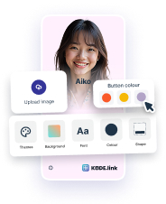
Need a HeyLink.me page that stands out?
Engage a professional design team to elevate and distinguish your HeyLink.me.
Need a HeyLink.me page that stands out?
Engage a professional design team to elevate and distinguish your HeyLink.me.
Small Variant - With Border
Compact layout with border. Button appears below text on both desktop and mobile.
Need a HeyLink.me page that stands out?
Engage a professional design team to elevate and distinguish your HeyLink.me.
Need a HeyLink.me page that stands out?
Engage a professional design team to elevate and distinguish your HeyLink.me.
Text Only Variants
Promotional messages without images.
Important Announcement
We've updated our terms of service. Please review the changes to continue using our platform.
Limited Time Offer
Get 30% off on all annual plans. Offer ends soon!
Custom Background Color
Use backgroundColor prop to set custom background colors.
New Feature Available
Check out our latest updates and improvements. Explore new tools designed to boost your productivity.
Success! Your account is verified
You can now access all premium features and start using our platform.
Exclusive Premium Access
Unlock all premium features and get priority support. Join thousands of satisfied customers today!
Usage Example
Example code for implementing Promo Banners
import { PromoBanner, Button } from '@monorepo/ui/DesignSystem';

// Default variant (no border)
<PromoBanner
  title="Special Offer"
  description="Get 50% off on all premium features"
  imageSrc="/promo-desktop.jpg"
  imageSrcMobile="/promo-mobile.jpg"
  imageAlt="Promo"
  primaryAction={<Button size="md">Learn More</Button>}
  onClose={() => console.log('closed')}
/>

// Small variant with border (no image on mobile)
<PromoBanner
  size="small"
  backgroundColor="bg-blue-50"
  title="New Feature Available"
  description="Check out our latest updates"
  primaryAction={<Button size="md">Explore</Button>}
/>
Props
| Prop | Type | Default | Description |
|---|---|---|---|
| size | 'default' | 'small' | 'default' | Banner size (default has no border, small has border) |
| backgroundColor | string | - | Custom background color (Tailwind class) |
| title | ReactNode | - | Banner title (required) |
| description | ReactNode | - | Banner description (optional) |
| imageSrc | string | - | Desktop image source URL |
| imageSrcMobile | string | - | Mobile image source (falls back to imageSrc) |
| imageAlt | string | 'Promo' | Image alt text |
| primaryAction | ReactNode | - | Primary action button |
| onClose | () => void | - | Close button handler |
Responsive Behavior
- Default Variant:
- • Desktop: Image (max-width 160px) + Text + Button stacked vertically. Padding: 24px 48px. Gap: 34px (image to text), 24px (text to button)
- • Mobile: Image (max-width 120px) + Text horizontal, Button full width below. Padding: 16px. Gap: 16px
- • No border
- Small Variant:
- • Desktop: Image (max-width 160px) + Text + Button stacked vertically. Padding: 16px. Gap: 32px (image to text), 24px (text to button)
- • Mobile: Image (max-width 120px) at top, Text below, Button full width at bottom. Padding: 16px. Gap: 16px
- • Has 0.5px border (brand-1)
- Images: Images are responsive with max-width constraints (120px mobile, 160px desktop). Height adjusts automatically to maintain aspect ratio.
- Close Button: Positioned absolutely - slightly outside on mobile (-8px), inside on desktop (8px)
- Typography: Title 14px/16px, Description 12px/14px
- Button: Full width on mobile, auto width on desktop